


I don't have a lot of smart devices in my house, but the ones I do have have always been smarter than their control interfaces. The lights respond to automations, my 3D printer reports its status to a server running in a VirtualBox VM, and my phones dutifully log their battery levels every few minutes.
But for the longest time, the dashboard tying all of this together looked like a settings menu from 2010. I converted my old Android phone into a smart home dashboard only to realize that in my attempt to smarten up my house, I had left the dashboard behind. But after some iteration, dead ends, and more YAML than I'd like to admit, my Home Assistant dashboard has finally caught up.
I turned my old tablet into a smart home dashboard, and it's perfect
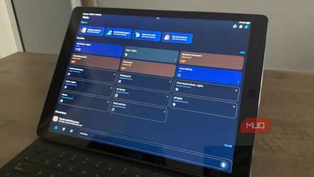
I use my 1st-gen iPad Pro as a smart home dashboard
A good dashboard starts with design, not devices
Why layout and usability matter more than adding another sensor
Home Assistant's Lovelace card system is great, but it wasn't going to cut it for my use. I made a deliberate choice to ignore Home Assistant entirely and designed a dashboard that I actually wanted as a standalone web prototype — a dark interface to not burn my eyes at 3 AM, a large clock, small greeting, battery pills for my Pixel phones, light cards that glow when toggled on, a switch for my AC with power consumption status a weather widget, and a calendar panel to see any tasks at hand.
The design went through several aesthetic phases before I finally settled on one. I started with a clean, teal card grid, had a brief flirtation with serif fonts and dark luxury vibes (which was quickly rejected for being too ornate), and finally, a phosphor-green terminal look. Green for healthy readouts, amber for warnings, cold blue for data, and red for errors. Once that was done, I added everything from my ceiling lights to my 3D printer into the mix and had a layout ready to go. Claude is my AI tool of choice for UI design, and it's surprisingly good at understanding your vision and coming up with an interface that doesn't immediately scream vibe-coding.

Now, since this layout was built around fixed pixel columns and wouldn't fit on my Pixel 9a. Instead of retrofitting responsiveness in the dashboard and potentially compromising the desktop layout I just finalized, I decided to build a simpler, easier-to-use dashboard for my phone from scratch. It's a single edge-to-edge vertical stack with all the controls right at the top, so I don't have to make any extra movements to get to what I need. The desktop dashboard keeps all the fancy information, and the phone dashboard only shows me what I want.
Now there was only one problem left. As a web developer, I know React, and Home Assistant doesn't speak that language.
Then Lovelace reminded me who was in charge
Turning a vision into reality takes more tweaking than you'd think

Home Assistant's dashboard system describes everything in YAML using built-in card types, plus whatever the community has built. You can drop in custom HTML and JavaScript and call it a day (believe me, I tried). An HTML card approach using WebSocket connections to pull live data also ran into CORS restrictions, as fetch calls from inside a card's iframe kept getting blocked.
This is where Mushroom Cards came in handy. This is a community-built collection of cards available through HACS — the Home Assistant Community Store — and it's free to use. The goal behind Mushroom is simple: you get a set of clean, Material UI-inspired cards that you can configure entirely through the visual editor, no YAML required.

The stack ended up being Mushroom for the core entity cards, Button Card for anything needing custom layouts, Atomic Calendar Revive for the calendar panel, Layout Card for the overall grid, and card-mod to bend everything's styling to my will. Layout Card's grid system gave me a three-column split. Devices, and lights stacked on the left, my 3D printer status in the middle, and weather and calendar on the right.

Home Assistant
- OS
- Windows, macOS, Linux, Raspberry Pi
- Developer
- Open Home Foundation
- Price model
- Free, Open-source
A self-hosted, open-source smart home platform that lets you control, automate, and unify all your devices locally without relying on the cloud.
One dashboard doesn't fit every screen
Why phones, tablets, and desktops need different layouts for the same home

The mobile dashboard was a bit of a headache. It's a single edge-to-edge vertical stack reordered by what I actually check on the go: a clock header with status pips for Home Assistant, my 3D printer, light toggles, the smart plug, the full printer panel, device batteries, weather, and a stripped-down seven-day event list instead of the desktop's month grid.
The trick that made it work was abandoning Mushroom entirely and rendering each section as raw HTML through Button Card's JavaScript templates. That meant real touch-friendly toggle pills with animated knobs, an expandable power-consumption readout on the Tapo plug, and sweetest of all, the Outfit and DM Mono fonts that the desktop version had lost pulled back through. If you're repurposing your old Android phone as an always-on bedside assistant, having a dashboard that fits well is important.
Thankfully, Claude Code seems to be quite gifted at making YAML dashboards and was able to get me most of the way to the final result. The only problems it faced were fixing some alignment and touch register issues on the phone dashboard. It required digging through the DOM tree to pinpoint problematic elements and fix them, but once you plug in enough data into Claude about what you want (or about where the error is), it can give you a perfectly functional and well-designed YAML dashboard without much effort.

Home Assistant Companion
- OS
- iOS, Android
- Price model
- Free & Open-Source
- App Type
- Smart Home Moitoring
- Open-Source?
- Yes
Home Assistant Companion is an Android and iOS app that connects your phone to Home Assistant, providing remote control, notifications, and access to device sensors for powerful automations.
The YAML pain was absolutely worth it
The payoff of building a dashboard tailored to your home
What I have now is a dashboard that reflects the home behind it. On the desktop, I see all the information I want in a manner that doesn't require squinting or precision clicking to control. On my phone, the dashboard only shows what I need, and the extra information is kept out of sight, but there if I need it.

I asked Gemini to write my Home Assistant automations, and it actually worked well
I never would have thought of this, but it was shockingly good
The lesson I'd pass on is to design backwards, twice if you have to. Mock up the dashboard you want with no constraints, translate it into Lovelace, and if a screen size fights you, build for it rather than settling on a compromise. My home has been smart for a while, now every screen controlling it finally acts like it knows that.